Design system
Buttons
Shape and color, split in two, with variants that stack.
The button model is split in two, and that split is the whole design: shape belongs to every button, color is painted only on a button wearing a variant.
Shape
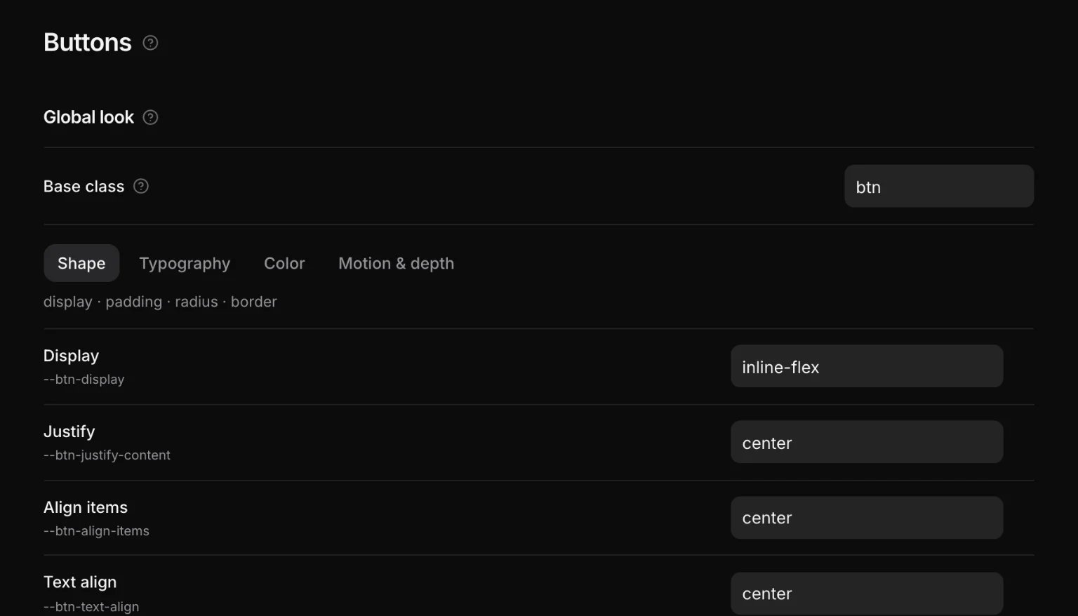
Padding, radius, border width, font, alignment — everything about the box — applies to <button>, to anything with the base class (.btn by default), and to anything wearing a variant. So a plain button is a well-shaped button in the browser's own colors until you say which one it is.
Every shape property reads a token:
:where([builder-data-element="button"]),
:where(.btn),
:where([class*="btn--"]:where(:not(.btn--none))) {
  display: var(--btn-display);
  padding-block: var(--btn-padding-block);
  padding-inline: var(--btn-padding-inline);
  border-radius: var(--btn-border-radius);
  font-family: var(--btn-font-family);
  font-weight: var(--btn-font-weight);
  transition: var(--btn-transition);
  cursor: pointer;
}
Edit those under Design → Buttons.
Color, and the tone
Color is painted only on [class*="btn--"], and everything it paints reads --btn-tone*:
| Token | Is |
|---|---|
--btn-tone | the color this button is currently speaking in |
--btn-tone-hover | the same color, one step along |
--btn-tone-contrast | text that stays readable on the tone |
--btn-tone-soft | the tinted fill a soft button uses |
It is deliberately not called accent: accent is a palette role, and .btn--accent is the variant that selects it.
Variants stack
A variant class does nothing but re-point --btn-* tokens. It has no rule of its own, which is why colors, styles and sizes combine freely:
<button class="btn btn--danger btn--outline btn--s">Delete</button>| Kind | Variants |
|---|---|
| Color | primary secondary tertiary accent base neutral success warning info danger |
| Style | outline soft text pill block |
| Size | xs s l xl — m is the button itself and needs no class |
A color variant moves the tone. A style variant decides how the tone is applied. A size variant changes font size and padding. Switching one off drops exactly its rule and nothing else.
.btn--none opts out of the paint entirely, for a button you intend to style yourself.
In the builder
A new Button arrives wearing .btn--primary. In the Element panel, the Button group lists the active variants as toggles: pick a color, pick a style, pick a size. A link can be a button by wearing the base class — the shape rule matches it too.
Never hand-write a button’s colors. If none of the variants is what you want, add one under Design → Buttons: a variant is a name and a set of token values, and it becomes a real class every button can wear.
Custom variants
Add your own with any of the token overrides — including ones no built-in variant sets. They emit alongside the built-ins, in the same shape, and appear in the Element panel with everything else.