Design system
Spacing & layout
The t-shirt scale, section spacing, content width and the site padding.
One t-shirt scale for the space inside things, a second for the space between bands, and three numbers that describe the page itself.
The spacing scale
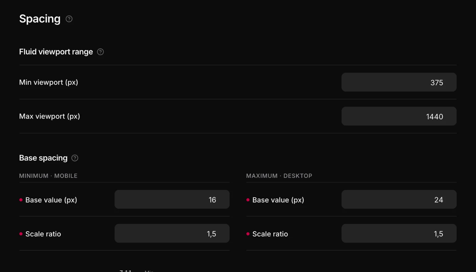
Same fluid model as type: each step is a clamp() between a mobile minimum and a desktop maximum.
:root {
  --space-xs:  clamp(0.444rem, 0.366rem + 0.334vw, 0.667rem);
  --space-s:   clamp(0.667rem, 0.549rem + 0.501vw, 1rem);
  --space-m:   clamp(1rem, 0.824rem + 0.751vw, 1.5rem);
  --space-l:   clamp(1.5rem, 1.236rem + 1.127vw, 2.25rem);
  --space-xl:  clamp(2.25rem, 1.854rem + 1.69vw, 3.375rem);
  --space-xxl: clamp(3.375rem, 2.781rem + 2.535vw, 5.063rem);
}
A ratio of 1.5 is a good default: each step is half again as big as the last, which is enough difference to read as intentional.
Section spacing
Bands need bigger, slower numbers than boxes, so they get their own scale:
--section-space-s: clamp(2rem, 1.531rem + 2.003vw, 3.333rem);
--section-space-m: clamp(3rem, 2.296rem + 3.005vw, 5rem);   /* a Section's padding-block */
--section-space-l: clamp(4.5rem, 3.444rem + 4.507vw, 7.5rem);
The gaps
Three named gaps built on the spacing scale, so "the space between things in a container" is a decision made once:
--container-gap: var(--space-l);
--content-gap:   var(--space-m);
--grid-gap:      var(--space-m);
Layout
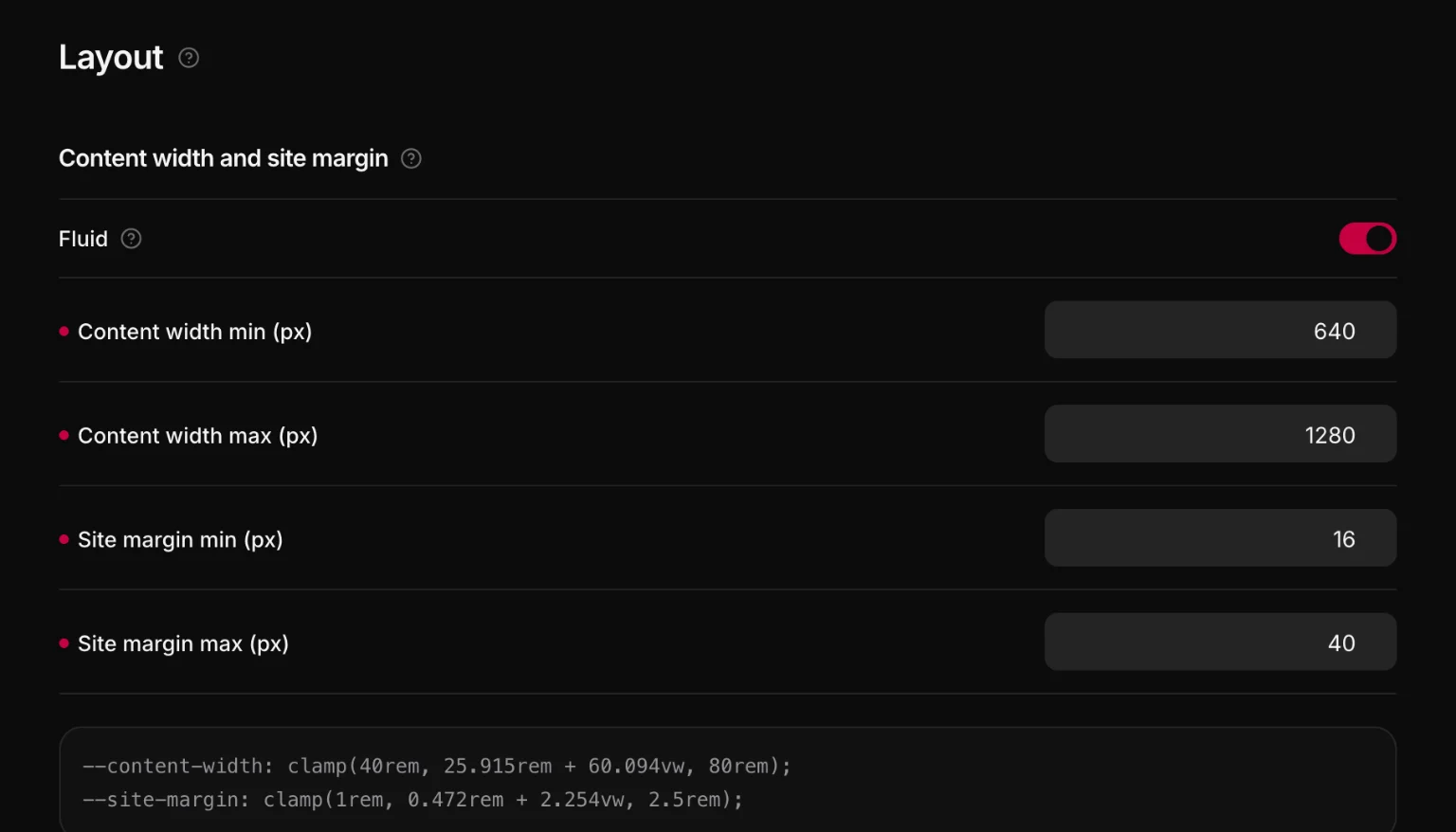
Three values describe the page:
--content-width: 80rem;
--site-padding: clamp(1rem, 4vw, 2.5rem);
--content-width-inset: min(var(--content-width), calc(100% - 2 * var(--site-padding)));- Content width is how wide the content column may get — what a Container reads.
- Site padding is the distance to the screen edge — what a Section reads.
- Content width safe is the one you want when an element is not inside a section that already paid the site padding.
Switch the module to fluid and both are computed as clamps across the same viewport range as every other scale, from a min and a max in pixels.
The rule that makes this work
The site padding is the Section's, the width is the Container's. A section is the band that touches both viewport edges, so it is the only element that knows where the edge is. A container is a width — max-inline-size: var(--content-width), centered — and nothing else.
Follow it and a bare heading in a section is still clear of the screen edge, and two nested containers do not pay the site padding twice.