Building
Styling
The Style panel, the CSS panel, selectors, breakpoints and the cascade sitereal writes into.
Styling in sitereal is writing CSS — with fields instead of typing, and with the rule always in sight. There is no utility soup, no inline styles and no class you did not ask for.
One element, one rule
The selector picker at the top of the Style and CSS panels says which rule you are editing. For a selected element that is, in order of what wins:
- its
#id, if it has one, - its first class,
- its element attribute —
[builder-data-element="section"]— when it has neither.
That third case is why an element with no class is still styleable. What the design system already gives the element is shown as the gray placeholder in every empty field — a Section’s padding reads section-space-m site-padding before its rule says a word — and nothing is written until you type.
The Style panel
On a text element the tab opens with its text, under what the element is — Heading, Paragraph, Link. It is the same field as in Settings, so the words stay in sight while you style them. Under it, a stack of folds:
Position · Layout · Spacing · Size · Typography · Background · Border · Shadow · Transforms · Appearance · Effects · Overlays
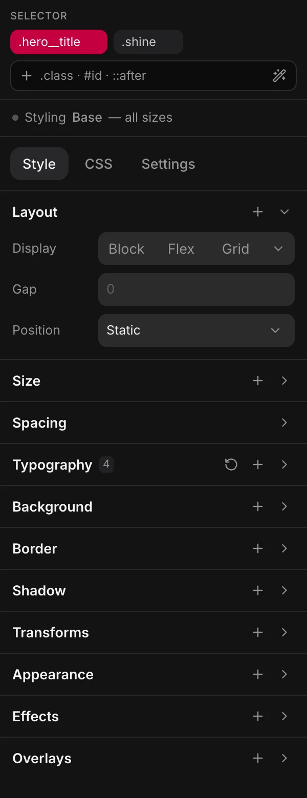
Position comes first because it is about the element itself, and Layout next because it is about the element’s children. Effects and Overlays come last because they are what an element does rather than how it looks. See Effects & states.
Position, Layout, Spacing, Size and Typography start open, the rest shut. Click a fold’s name to open or shut it; sitereal remembers which you keep open. A shut fold that holds something shows a count.
Every field writes one declaration and knows how to unwrite it: the × appears only while there is something to remove, so it costs no width in an empty row.
The + in a fold’s head adds a row the fold doesn’t show yet. It lists each one by the CSS property it writes — order, aspect-ratio, overflow — with its name on hover. A fold that holds something also has a reset in its head that removes exactly what its count counted.
A padding, a margin, a border width or a radius is one field until you ask for the four sides, drawn around a small square where they act. And on a heading or a paragraph, Typography opens with its Style — an h2 already reads Heading 2, from the design system — where you can pick another step, None, or Detach it into plain values.
Position
The mode is the select in the fold’s head, so a shut fold still says Static. Inside are Self align, Justify self when the element sits in a grid cell, and, once the element is positioned, the four insets drawn around the box they pin and a Z index you can step up or down. Item order is order in the + menu.
Layout
A chip names the display mode, and the modes are pictures across the fold: Block, Flex, Grid, None, and ⋯ for Inline flex, Inline block, Inline grid, Inline and Custom…. With nothing declared, the chip shows what the browser makes of the tag, in a quieter color. The × on the Display row removes it.
On a flex box, press Flex again to turn a row into a column and back. The Direction row under the modes does the same with Row and Column tabs, plus a button that reverses the direction. Wrap is a select: Nowrap, Wrap or Wrap reverse.
Under them is Align. Click a spot on the pad to place the children, double-click to spread them, or pick in words under X and Y. X is always horizontal and Y always vertical, whatever the direction; the panel works out which property that is. The gap sits under them.
Grids
A grid shows as a picture of its cells — 3×2 — beside a Columns and a Rows count. Click the picture to open the Grid card:
- A cell picker: point at the last cell of the grid you want and click.
- Responsive, on by default, with a Min width. The grid never has more columns than the count, and fewer as the box narrows — one declaration, no breakpoint. Off, it keeps the same number of columns at every width.
- Join cells: drag across cells to join them, click a joined area to split it, or Split all. Child 1 goes in area 1, child 2 in area 2, and so on. Areas are always rectangles.
- Columns and Rows as CSS, for track lists no count can say. The picture then reads Custom.
Joined cells keep their columns at every width, so Responsive is off while any are joined. For a different layout on a phone, switch to that breakpoint and join the cells again there. A new size drops the joins.
Joining writes grid-template-areas on the grid and one rule per child, such as .cards > :nth-child(1) { grid-area: a; }, in the grid’s own stylesheet. Children are placed by position, not by class, because a grid’s children are often a Loop’s copies of one element. Join cells is offered only on a plain selector, not on a state like :hover.
A grid’s Align is a nine-cell pad for where the items sit in their cells, with X and Y in words and the gap under them. Its children get Columns and Rows spans at the top of Size, and Justify self in Position.
Size
Three rows — Size, Min and Max — each a width and a height. An arrow in the field says which is which, and its name is on hover. Aspect ratio, overflow and object fit are in the + menu.
Values and variables
A value field shows the value at its left edge, then the { } button, then the ×. Bind a field to a variable and the box turns red and shows the variable’s name instead of var(--…) — the notation is a hover away, because that is what the CSS says.
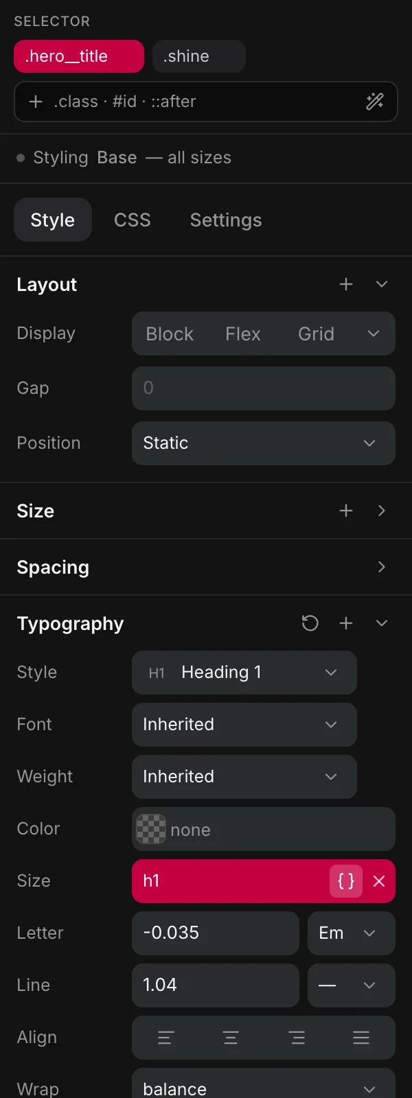
Only a value that is nothing but one reference becomes a chip. calc(var(--space-m) * 2) stays a value you can type in.
The variable picker is a panel, not a menu: search at the top, New variable under it, then your variables that suit this field, the design system's tokens, then everything else. See Variables.
Colors
One control everywhere: a swatch, the value, and the variable button. Solid · Linear · Radial · Conic · Image are tabs of the same control, because "what is this box filled with" has one answer and one declaration. Alpha is part of the value (#0f172acc), not a second field.
Any CSS color is parsed by asking the browser what it computes to, so a notation nobody thought of still works. A value that is not a plain color — var(--primary), currentColor — is shown and left alone, never flattened to a hex.
Transforms
Nine rows, none of them shown until you add one from the fold’s +: Scale, Skew, Rotate, Offset, Depth, Perspective, Origin, Backface, Preserve 3D. The menu lists each by the property it writes, with its name on hover. They arrive neutral (scale: 1, rotate: 0deg) — a transform that moved the element on the way in would be the panel doing something you did not ask for.
Individual properties throughout (scale, rotate, translate), never the transform shorthand: a reveal writes translate and a scroll link writes transform, and a panel taking the shorthand would fight both for one slot. Skew is the exception CSS forces, and is written into transform alone.
The CSS panel
The same rule as text, with the selector fixed at the top:
.card {
  display: flex;
  gap: var(--space-s);
  border-radius: var(--radius-m);

  &:hover { border-color: var(--primary); }

  @media (max-width: 48rem) {
    flex-direction: column;
  }
}- Completion for properties, values, and your own tokens — your variables and the design system's, resolved to what they actually are.
- Recipes: type
?for a shortcut that expands to plain CSS.?auto-gridwrites a grid that stacks itself with no media query;?stack,?row,?center,?cover,?grid-2-3and the rest expand the same way. What you get is ordinary CSS, still hand-editable afterwards. - Format tidies the rule, and runs when you leave the field.
Nested rules are kept verbatim. The Style panel edits the declarations and leaves everything nested inside the rule alone, so &:hover, &::after and @media blocks survive being touched by fields.
Breakpoints
The canvas shows every breakpoint side by side — Desktop 1200, Tablet 768, Phone 390 by default. above the canvas show one at its real size, and adds one of your own. Working in a frame is what picks the breakpoint you are editing, so a change made in the tablet frame lands in that breakpoint’s media query, inside the same rule:
.hero__title {
  font-size: var(--h1);

  @media (max-width: 768px) {
    font-size: var(--h2);
  }
}
The project's strategy — desktop-first or mobile-first — decides whether that query is a max-width or a min-width. Drag a frame's edge to see what happens between breakpoints without adding one.
At a breakpoint the fields hold that breakpoint’s own values, but the panel still reads the base rule for what the element is. A flex box reads Flex in the phone frame, with its Direction and Align rows, in a quieter color until the breakpoint says something of its own.
Logical properties
Fields, generated defaults and completions all speak logical CSS: inline-size, block-size, margin-inline, padding-block, inset-block-start. The panel still reads a physical property so pasted CSS keeps working, and moves it to the logical name when you edit that field.
Where a rule lives
From the widest reach to the narrowest:
| Where | Reaches | Edited in |
|---|---|---|
| the design system | everything | Design |
| a global stylesheet | every page | Styles |
| a template’s sheet | pages using that template | the template |
| a component’s sheet | every instance | the component |
| the page’s sheet | this page | the page |
The design system's rules are wrapped in :where(), which contributes zero specificity — so anything you write beats them without !important, whatever the source order.