Getting started
Your first page
From an empty project to a styled, saved page in ten minutes.
Ten minutes, one page, nothing hand-written. By the end you will have a styled page on disk, a component you can reuse, and a header that every future page inherits.
1. Make a page
Open Page at the top left and choose New page…. Its route is its address: about becomes /about.
2. Insert a Section
in the top bar (or ⌘E) opens Insert. Start with a Section, and put a Container inside it.
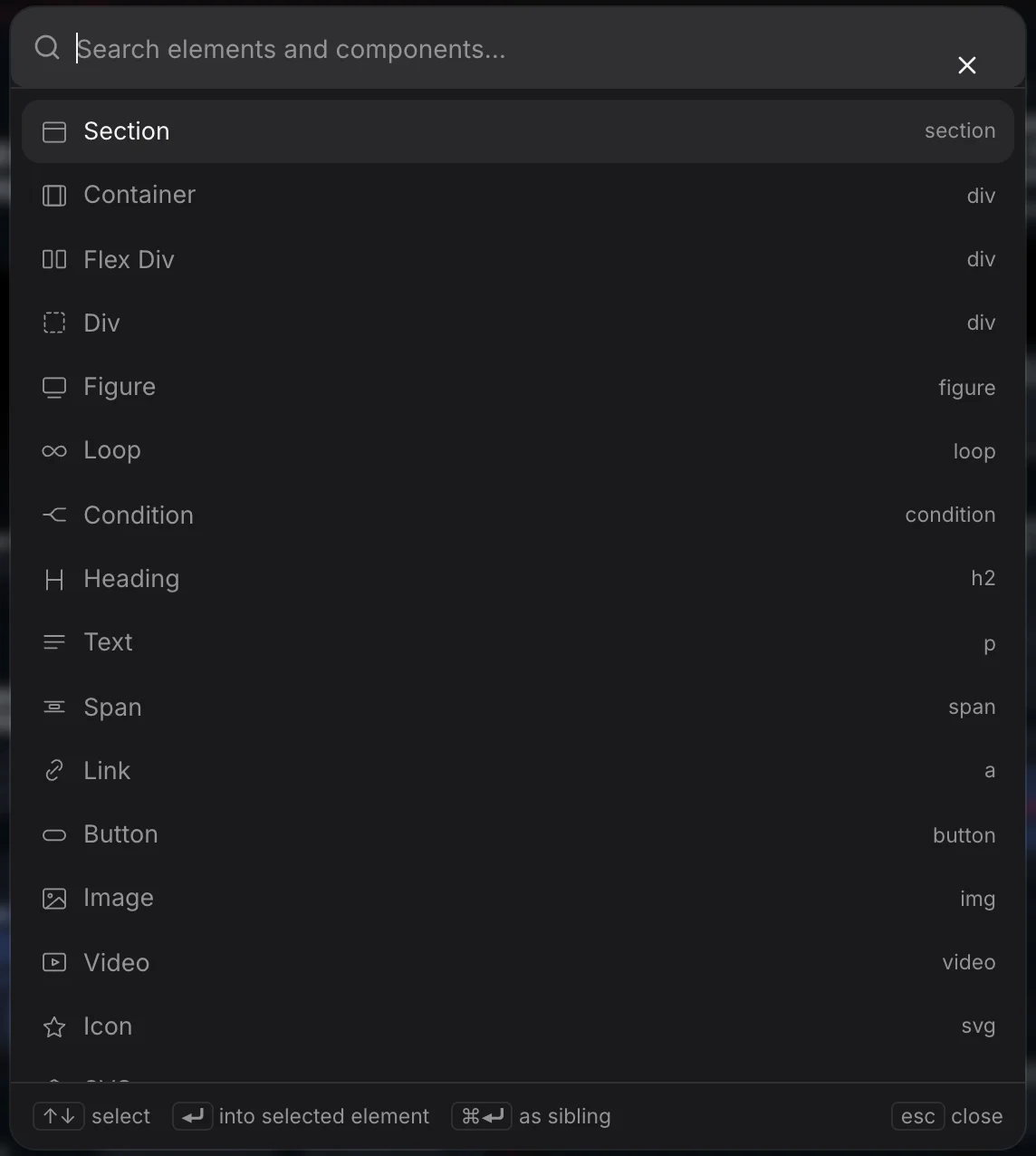
The two are not interchangeable, and the difference is worth learning once:
- A Section is the band that touches both edges of the viewport. It carries the page's site padding, so everything inside it is clear of the screen edge.
- A Container is a width —
max-inline-size: var(--content-width), centered. That is all it is.
Do not put page padding on a container. Two nested containers would pay the site padding twice, and a heading dropped straight into a section would run into the screen edge.
3. Add content
Inside the container, insert a Heading and a Text. Double-click either on the canvas to edit its words in place. The tree on the left is the same page from the other side — drag to reorder, right-click for duplicate, wrap and delete.
4. Name it, then class it
Select the section and rename it in the tree — call it Hero. Names are what the layer list shows, and they are what class generation reads.
Right-click the section in the tree and choose Generate BEM classes. Those names become the classes the CSS will use:
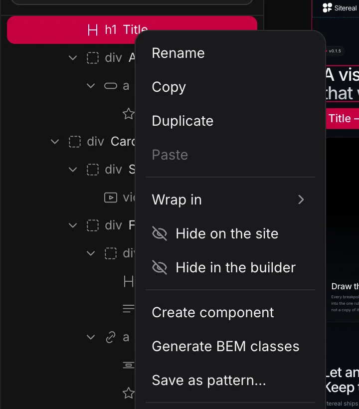
Hero            →  .hero
  Container     →  .hero__container
  Heading       →  .hero__title
  Text          →  .hero__text
The first class is the element's selector — the rule the Style panel and the CSS panel write to. Keep the BEM one first.
5. Style it
With the heading selected, the panel on the right opens on Style. Every field writes a declaration into that element’s own rule; the × beside a field removes it again. The { } button binds a field to a variable, and a bound field turns red and shows the variable’s name.
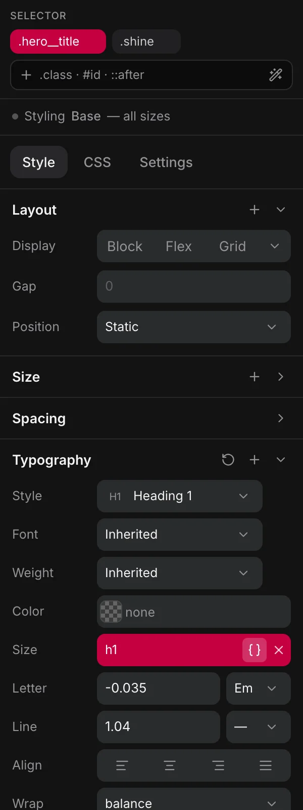
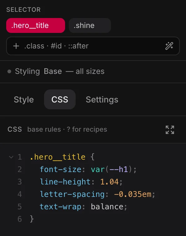
Switch to the CSS tab to see exactly what you just wrote:
.hero__title {
  font-size: var(--h1);
  max-inline-size: 20ch;
}
Both tabs edit one rule. Nothing is stored twice.
6. Make it responsive
The canvas shows every breakpoint side by side. Click into the tablet frame and change the same field: the declaration lands in that breakpoint's @media block inside the same rule, and the desktop value is untouched.
7. Reuse it
Anything you would build twice is a component: select the subtree, Create component, and drop an instance wherever you need it. Anything around the page — header, footer — is a template, so it is never built into a page. See Components and Templates.
8. Save
⌘S saves the page. On disk you now have:
src/pages/about.astro
src/styles/generated/pages/about.css
Open them. That is the whole output — no runtime, no data attributes beyond builder-data-element, no build step of ours between what you see and what ships.
Where to go next
- Elements — what each element is for.
- Styling — selectors, states, breakpoints and the cascade.
- Design system — stop writing values, start spending tokens.