Design system
Typography
Fluid type scales, heading scales, fonts and the running-text tokens.
Two fluid scales — one for text, one for headings — plus the fonts and the running-text settings the whole site reads.
Fluid scales, not breakpoints
Every step is a clamp() between a mobile minimum and a desktop maximum, interpolated across the viewport range. No media queries are needed for base responsiveness:
:root {
  --text-xs:  clamp(0.694rem, 0.685rem + 0.038vw, 0.72rem);
  --text-s:   clamp(0.833rem, 0.81rem + 0.1vw, 0.9rem);
  --text-m:   clamp(1rem, 0.956rem + 0.188vw, 1.125rem);
  --text-l:   clamp(1.2rem, 1.127rem + 0.31vw, 1.406rem);
  --text-xl:  clamp(1.44rem, 1.328rem + 0.477vw, 1.758rem);
  --text-xxl: clamp(1.728rem, 1.563rem + 0.705vw, 2.197rem);
}
You set four numbers per scale — minimum size and ratio at the small end, maximum size and ratio at the large end — and the module does the rest. The viewport range those clamps are built across (default 375px → 1440px) is shared by every scale, so type, spacing and layout all finish growing at the same width.
Any single step can be overridden by hand without giving up the generated scale — and it can grow over a screen-width range of its own: the at field beside each size says at which width the step reaches it, so a hero heading can start growing only at a tablet’s width. Empty is the site’s range.
Headings
The heading scale is its own four numbers, emitted as --h1 … --h6, with one rule per level:
:root {
  --h6: clamp(1.125rem, 1.081rem + 0.188vw, 1.25rem);
  --h3: clamp(2.197rem, 1.928rem + 1.147vw, 2.961rem);
  --h1: clamp(3.433rem, 2.79rem + 2.746vw, 5.261rem);
}

:where(h1) { font-size: var(--h1); }
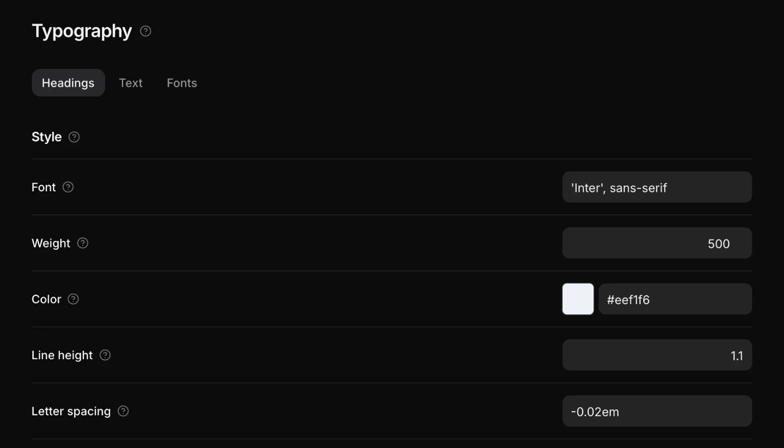
Everything else about a heading — family, weight, color, line height, letter spacing, case, wrap and measure — is answered once, in the Style block at the top of the Headings tab, and the Text tab has the same block for running text. One level may still say something for itself: the chevron on each step opens its own weight, line height, letter spacing and case, empty until you type, so h3 can be a shade lighter than the rest without a rule written against a tag.
Running text
The body's own settings are emitted as tokens rather than baked into a body rule, because a paragraph reads the same two:
:root {
  --text-size: var(--text-m);
  --text-color: var(--base-300);
  --text-line-height: 1.6;
  --heading-weight: 600;
  --heading-color: var(--white);
  --font-primary: Inter, system-ui, sans-serif;
  --font-heading: Inter, system-ui, sans-serif;
}
Changing the site's text size moves the text, not only whatever happens to sit directly in <body>.
The root font size
html { font-size: … } as a percentage. 100% is the browser default (1rem = 16px); 62.5% makes 1rem = 10px, which some people prefer for arithmetic. The generated clamps are computed in the right unit either way — the whole scale does not shift when you change it.
Fonts
Design → Typography → Fonts installs a Google font into the project — or uploads one you bought: the files are copied into public/fonts/<family>/, and the @font-face rules are written into the generated sheet with font-display: swap.
@font-face {
  font-family: 'Inter';
  font-style: normal;
  font-weight: 600;
  font-display: swap;
  src: url('/fonts/inter/600.woff2') format('woff2');
}
Self-hosted, versioned with the project, no request to a third party at runtime. Removing a family drops its files and its rules.
Family names go into --font-primary and --font-heading, which is what everything else reads.