Design system
Overview & modules
What the design system emits, and what switching a module off actually removes.
The design system is one generated stylesheet — src/styles/generated/framework.css — holding the tokens a site is built out of and the defaults every element starts from. It is edited under Design, and it is modular: eighteen modules, each one block of that sheet and one screen in the rail, switched together.
The master switch
The whole system can be off. A project that wants to write every value by hand switches it off and the sheet stops being emitted at all — nothing else changes, because nothing in the emitted markup depends on it.
That is a different question from switching a module off, which is the next section.
The modules
| Module | What it emits |
|---|---|
| Icons | nothing — it is the screen where icon sets are installed so you can search them |
| Colors | --{role} for every active role, its shades and transparencies, the page background and the ink |
| Typography | --text-*, --h1 … --h6, the families, the heading and running-text style, the root size, the h1–h6 rules |
| Spacing | --space-*, --section-space-* |
| Buttons | the --btn-* tokens, the button shape rule, the paint rule and every variant class |
| Elements | one rule per element kind — what a section, a heading or a link looks like by default |
| Forms | what an input, a label, a select and a checkbox look like, and the look of a form’s parts |
| Navigation | what a menu looks like, and the breakpoint it collapses at |
| Carousel | the look of slides, arrows and dots |
| Popups | the look of a panel in each placement, and its scrim |
| Consent | the look of the cookie banner, the preferences panel and the badge that reopens it |
| Layout | --content-width, --content-width-inset, --site-padding, and the two rhythms --container-spacing and --content-spacing |
| Borders | --border-width, --border-light, --border-dark, --border, --border-strong, --radius-s/m/l, --image-radius |
| Shadows | --shadow-s, --shadow-m, --shadow-l — in black, or in a color from your palette |
| Textures | one .texture--* class per named background layer — noise, a grid, stripes |
| Themes | one .theme--* class per room: a band that re-points the background and the ink, and everything inside follows |
| Motion | --motion-duration, --motion-ease, --motion-distance, --motion-stagger, --motion-perspective |
| Accessibility | the focus ring tokens and one :focus-visible rule, plus utility classes — .clickable-parent, .accessibly-hidden, .hidden-until-focus, .tap-target |
Off means the block is not emitted and the screen leaves the rail. A site that writes its own depth is not reading past a Shadows page it will never open.
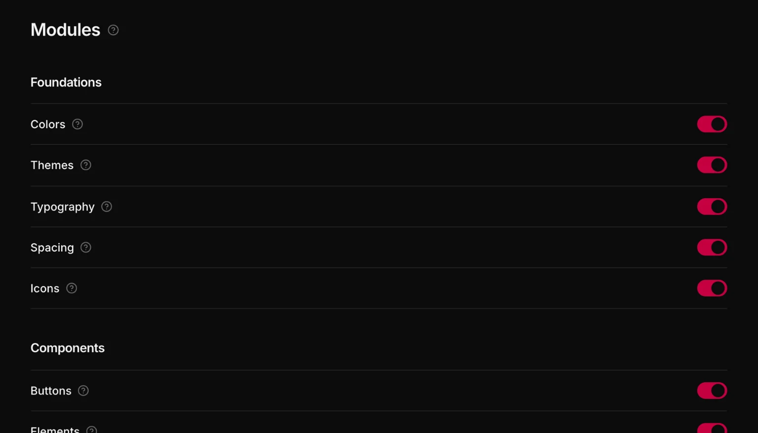
Nothing is deleted. The values stay in the project document, so switching a module back on brings your settings back exactly as they were.
Forms, Navigation, Carousel, Popups and Consent are the looks of parts that also have to work. What a part needs to work — a closed flyout hidden, a carousel track that scrolls and snaps, a popup where its placement says — is emitted whatever you switch off; the module switches only its look. And a class you put on a part always wins over that look.
Loose ends
Modules read each other's tokens: Typography reads Colors, Buttons reads Colors, Elements reads Colors, Typography, Spacing, Borders and Layout, and the five part modules read most of the foundations. Switch off something another module is spending and the Modules screen lists it under Loose ends.
It is reported, not enforced. A var() you are about to declare by hand is a legitimate thing to be halfway through — the app tells you and gets out of the way.
Zero specificity, on purpose
Every generated element rule is wrapped in :where():
:where([builder-data-element="section"]) {
  display: flex;
  flex-direction: column;
  padding-block: var(--section-space-m);
  padding-inline: var(--site-padding);
}
:where() contributes nothing to specificity, so any class or id you write beats the design system without !important and without depending on source order. The idea is generous defaults that never fight you.
And because the selector is the element attribute, structural styling never depends on a class you might rename.
Where the screens live
Design in the rail opens the design system. Its screens are grouped:
- Settings — three tabs: Framework (the built-in system, or a stylesheet of your own pasted or uploaded in its place), Modules (one switch per module), and Import & export (the whole design system as one file)
- Foundations — Colors, Themes, Typography, Spacing, Icons
- Components — Buttons, Elements, Forms, Navigation, Carousel, Popups, Consent
- Frame — Layout, Borders, Shadows, Textures, Motion, Accessibility
Grouping is what turns eighteen screens into an overview. Settings is the one screen that can never be switched away.