Building
Components
Named subtrees with typed props, emitted as real .astro files.
A component is a named subtree with typed properties, emitted as a real .astro file. It is the first answer to "I need this twice".
Making one
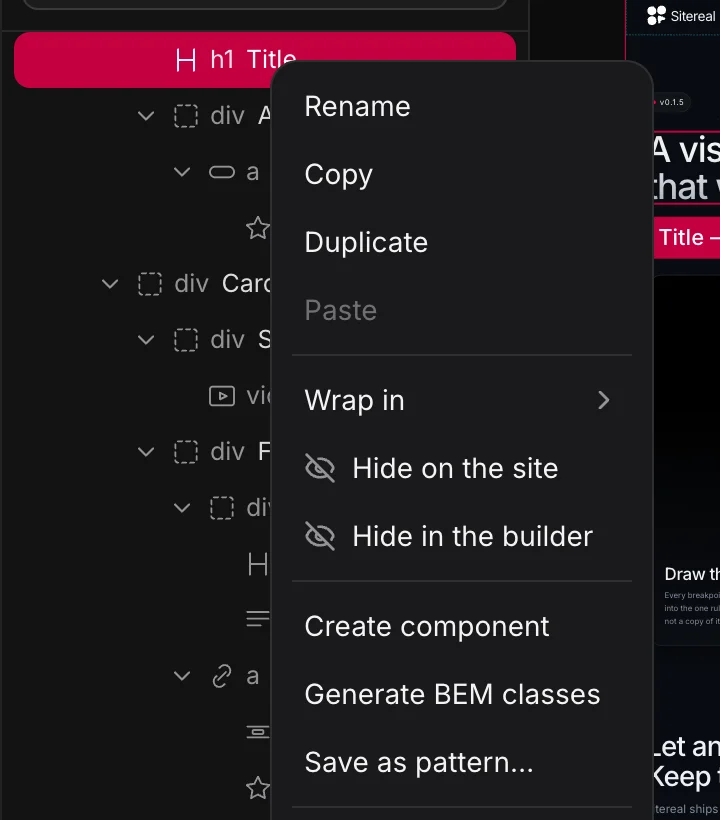
Select a subtree in the tree, right-click, Create component. It is replaced in place by an instance — the page now points at the component instead of holding a copy of its markup.
Open a component to edit it and the canvas switches to the component itself, with a breadcrumb back to the page. Opening a component from inside another one is not a one-way door; every step in the trail is a way back.
Properties
Declared in the Properties tab while you are editing the component, filled per instance in the Settings tab. Write {props.title} in text or in an attribute and it becomes a real Astro prop — or press the { } button beside a field to make a property out of what is already in it, bound in one go:
---
interface Props { title?: string; body?: string; href?: string; }
const { title = "Fast", body = "Zero JavaScript by default.", href = "/" } = Astro.props;
const props = { title, body, href };
---
<a builder-data-element="link" class="feature-card" href={props.href}>
  <h3 builder-data-element="heading" class="feature-card__title">{props.title}</h3>
  <p builder-data-element="text" class="feature-card__body">{props.body}</p>
</a>
Types: text, number, boolean, url, select (with options), media, class, loop, object, condition and group. Each one changes the control an instance gets and how the value is emitted — a number stays a number, a boolean becomes a bare attribute or false, a media prop opens the media picker.
A prop with a default is what an instance uses when it leaves the field empty. A property no field uses yet says so under its default — and when the field it was meant for still holds the same words as typed text, the note names that field and offers to put the property there.
A component travels whole
It carries its own stylesheet and its own script, exactly like an .astro file:
- Styles emit as a
<style>block, which Astro scopes to this component's markup. - Script emits as a
<script>, which Astro bundles once per page however many instances there are — so query all of them, do not assume one.
Drop the component on a page that has never seen it and it still looks right.
Both are edited with the component open: its styles in the Style and CSS panels like any element’s, its script in the JS tab of the right column — Maximize gives a long one the whole window.
A class you want to use outside the component belongs in a global stylesheet. Astro's scoping means a component's own styles apply to its own markup and nothing else.
Using one
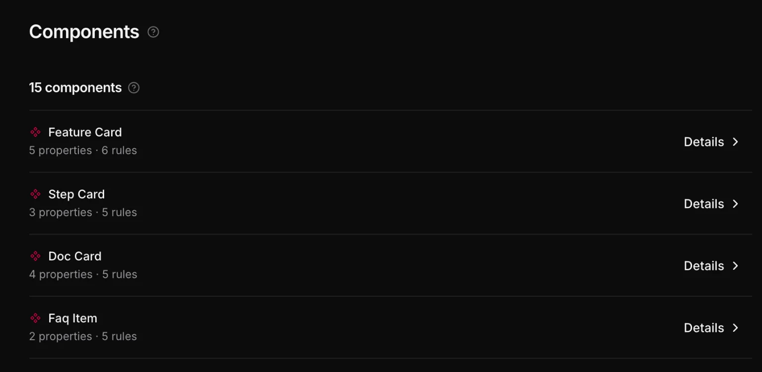
Instances appear in Insert (, ⌘E) under your components. On the page an instance is one node with a component reference and its prop values — no copy of the markup, so a change to the component reaches every instance at once. Settings → Components lists them all with what each one can be asked for:
Emitted, that is an import and a tag:
---
import FeatureCard from '../components/FeatureCard.astro';
---
<FeatureCard title="Fast" body="Zero JavaScript by default." href="/speed" />
Slots: content an instance brings
A component can hold a Slot — add it from + while the component is open; there is one per component. It is where an instance’s own elements go: a card’s body, a section frame’s content, a modal’s text. Put elements inside the instance on a page — in the layers, or with + while it is selected — and they render where the Slot is. Whatever you put inside the Slot itself is its fallback, shown wherever an instance is given nothing.
---
const { title } = Astro.props;
---
<article class="card">
  <h3 class="card__title">{title}</h3>
  <slot />
</article><Card title="Harbor House">
<p>A house on the water, finished in 2024.</p>
</Card>It is Astro’s own <slot />, so what an instance is given belongs to the page: its bindings and its styles are the page’s. A component without a Slot takes no children.
Component libraries
Assets → Libraries adds components from a library made for Astro. Starwind UI is the first, in beta: accessible components styled with Tailwind 4, in the shadcn way. A component is copied into your project as its own .astro files, which you own and can edit.
- Switch the library on to set it up. Its own installer runs in your project, brings Tailwind and a stylesheet of tokens, and the screen says what it did. It cannot be switched off again from there: what it installed is the project’s.
- Add on a card copies that component in. It then sits in + and ⌘K under the library’s name, and Place on the page puts down the library’s own example, each part a layer of its own.
- A page loads the library’s stylesheet only where it uses one of its components, and the library’s colors stay on its own components: your design system’s tokens keep their values.
- A library you set up yourself in a terminal is found and listed the same way, and its stylesheet is left as you wrote it. Its components have to be under
src/componentsto be placed.
When to use what
| You have | Use |
|---|---|
| A card, a feature row, a CTA, a testimonial | a component |
| A header, a footer, anything around the page | a template |
| A tracking script, a font link, a bit of CSS on some routes | a snippet |
| A class more than one page needs | a global stylesheet |
The rule of thumb: when you catch yourself building the same subtree twice, stop and make it a component. Two copies is the moment they start drifting apart.